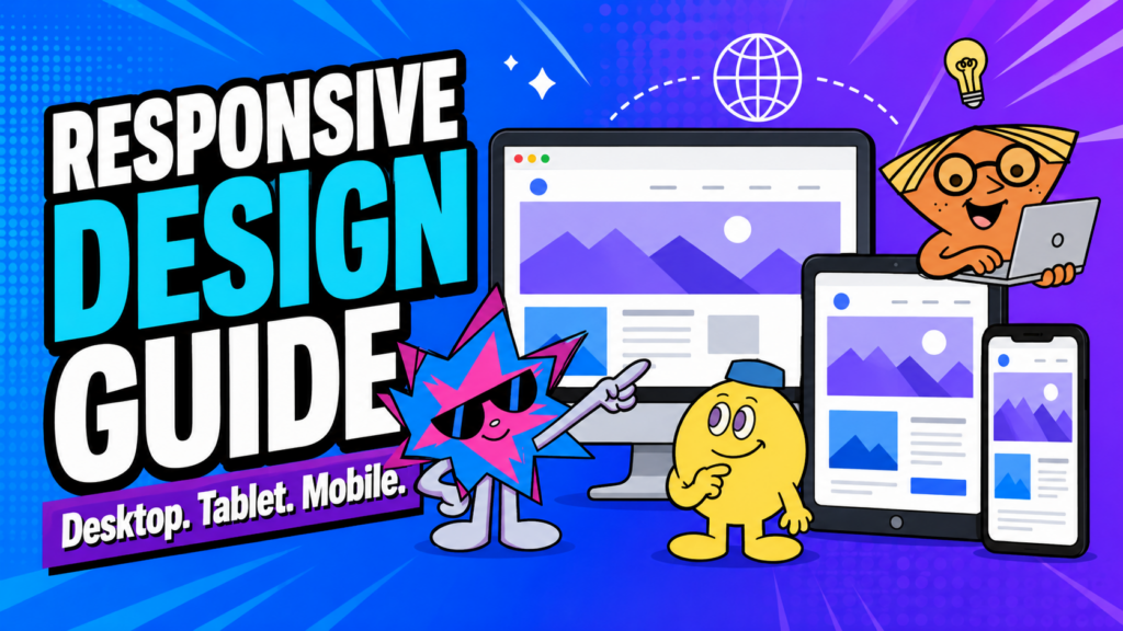
| Quick answer: A responsive website changes its layout, spacing, imagery, navigation and controls to suit the screen a person is actually using. It is not simply a desktop website squeezed onto mobile. A good responsive site keeps the message clear, the content readable, and the next step easy across desktop, tablet and mobile. |
Key takeaways
- Prioritise content and actions for smaller screens instead of squeezing everything into the same layout.
- Check text, buttons, forms, images and navigation on real mobile devices.
- Keep the core message and next step consistent across every screen size.
Why this matters
A website is not truly finished when it looks good on a desktop screen.
Visitors may discover it on a phone, compare options on a tablet, and complete an enquiry on a laptop. If the content becomes hard to read, buttons become difficult to tap, or the layout breaks on smaller screens, the website starts creating friction before the visitor has even understood your offer.
Responsive website design is the practice of making content adapt sensibly across different screen sizes. It is not simply shrinking a desktop layout. It is deciding what needs to move, stack, resize, simplify, or disappear so users can still understand the page and take action.
In Singapore, visitors use both major screen types. Statcounter recorded 46.1% mobile and 52.73% desktop web traffic in June 2026. This is a time-bound traffic snapshot, not a universal rule, but it shows why both mobile and desktop experiences need attention. Source: Statcounter Global Stats
Google uses mobile-first indexing, which means it primarily uses the mobile version of a site’s content for indexing and ranking. That makes it important for the mobile version to contain the same meaningful content as desktop. Source: Google Search Central
Google also recommends keeping meaningful content, headings, metadata and structured data equivalent across mobile and desktop versions so the mobile experience does not become a thinner version of the main site. Source: Google Search Central
What Is a Responsive Website?
A responsive website changes its layout based on the screen and device being used.
- Flexible grids
- Responsive images
- Adjusted spacing
- Stacked content blocks
- Mobile menus
- Re-sized typography
- Touch-friendly buttons
- Simplified interactions
The goal is not to make every screen look identical. The goal is to preserve usability and clarity.
Why Responsive Design Matters for Conversions
A person on a phone has less screen space, less patience, and often more distractions.
If the page requires pinching, zooming, horizontal scrolling, or precise mouse actions, the visitor has to work harder than they should. That creates friction.
A responsive site supports conversion by making it easier to:
- Read the main message
- Navigate to important pages
- Tap buttons
- Fill out forms
- View products or examples
- Contact the business
For a broader guide to reducing friction, read 7 Website Mistakes That Make Visitors Leave and How to Fix Them.
Start With Content Priority
Responsive design begins with a simple question:
What does the user need first on this screen?
On a large desktop screen, you may be able to show a large visual, multiple columns, a detailed menu, and supporting information at once.
On mobile, you often need to prioritise:
- Main value proposition
- Primary CTA
- Essential proof
- Most important content
- Simple next step
Do not simply squeeze everything into a smaller width. Reconsider the sequence.
Build with Flexible Layouts
Avoid layouts that depend on a single fixed width.
Use containers, grids, and spacing systems that can adapt. A two-column desktop layout may need to become a stacked mobile layout. A horizontal comparison table may need to become cards. A large hero section may need a different crop or image arrangement on mobile.
The details depend on the content, but the principle stays the same:
The layout should serve the user, not force the user to adapt to the layout.
Make Text Readable
Text that is too small, too tightly spaced, or too wide can make a page difficult to use.
Review:
- Heading size
- Body text size
- Line height
- Paragraph width
- Contrast
- Spacing around buttons and forms
On mobile, long lines can become tiring and tightly packed sections can feel overwhelming. Give important content room to breathe.
Design Buttons for Touch
Desktop users can hover precisely. Mobile users tap with a thumb.
Buttons should be large enough to tap comfortably and far enough apart that users do not hit the wrong option. Avoid interactions that depend only on hover states, because phones do not work that way.
Also make the CTA easy to reach. A user should not need to scroll through a long page just to find the contact option again.
Read How to Write Website Buttons and CTAs That Get More Enquiries for CTA-specific guidance.
Adapt Images and Video
Images must be reviewed on mobile, not simply scaled down.
Check:
- Does the crop still make sense?
- Is the subject still visible?
- Does the image take too much vertical space?
- Is it slowing the page down?
- Does it help the visitor understand the content?
Large videos and background media can be particularly heavy on mobile connections. Use them only when they help. Consider lazy loading, click-to-play, and lighter formats where appropriate.
For performance guidance, read How to Fix a Slow Website and Stop Losing Customers.
Simplify Navigation on Smaller Screens
Navigation is often one of the biggest responsive challenges.
A desktop header might show many top-level links, submenus, and utility actions. On mobile, that can become difficult to scan.
Use a mobile menu that makes the priorities clear. Keep labels straightforward. Avoid hiding key contact actions too deeply.
The goal is not to reproduce every desktop navigation element exactly. It is to help the user reach the page they need without confusion.
Test Forms Carefully
Forms often fail on mobile because of small fields, unclear labels, awkward keyboard behaviour, or too many required questions.
Check that:
- Fields are easy to tap.
- Labels remain visible.
- Error messages are clear.
- The form does not require excessive typing.
- Dropdowns and date fields work on touch devices.
- Confirmation messages are easy to understand.
A form is usually close to the conversion point. It deserves careful testing.
Keep Important Content Consistent
Do not remove important information from mobile simply because the design becomes harder.
Google’s mobile-first indexing guidance recommends keeping the primary content, headings, metadata, structured data, images, and relevant alt text consistent across mobile and desktop versions. Source: Google Search Central
You can change layout and presentation. But the core information should remain available.
Nebulon’s Responsive Approach
At Nebulon, responsive design is part of the build process, not a final checkbox.
We consider how components stack, how imagery changes, how navigation behaves, and what information users need on smaller screens. Some desktop arrangements need to become vertical. Some decorative elements need to be simplified. Some content needs to be prioritised.
The result should feel designed for the screen it is on.
Final Thoughts
Responsive design is about respect for the visitor’s context.
They may be on a phone, in a hurry, on a weaker connection, or using one hand. A responsive website should still make the value clear and the next step easy.
For more on user flow, read How to Structure Your Website So Visitors Know What to Do Next.
Sources and Further Reading
1. Google Search Central, Mobile-First Indexing Best Practices: https://developers.google.com/search/docs/crawling-indexing/mobile/mobile-sites-mobile-first-indexing
2. Google Search Central, SEO Starter Guide: https://developers.google.com/search/docs/fundamentals/seo-starter-guide
3. Statcounter Global Stats, Desktop vs Mobile vs Tablet Market Share in Singapore (June 2026, accessed 10 July 2026): https://gs.statcounter.com/platform-market-share/desktop-mobile-tablet/singapore