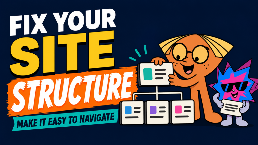
Quick answer A good website structure follows the order people need to make a decision. First, help them understand what you offer. Then show why it matters, answer the questions that create doubt, provide proof, and make the next step obvious. Your sitemap, navigation, page sections, headings, and internal links should all work together to guide that journey.
Key takeaways
- Structure your website around the visitor’s questions, not your company’s internal departments or every idea you want to show off.
- Every important page needs one clear job. It should help visitors understand something, trust something, compare something, or take a specific next step.
- A strong sitemap, straightforward navigation, visual hierarchy, and contextual internal links make the site easier for both people and search engines to understand.
Jump to a section
For WordPress, publish this as an on-page jump menu. Use the matching lowercase heading slug as each section’s anchor ID, for example #why-website-structure-matters. These links are clickable inside this working document too.
- Why website structure matters
- What website structure actually includes
- Start with the visitor’s main decision
- Map the questions users need answered
- Structure your homepage like a conversation
- Build navigation around real user needs
- Give every page one job
- Use visual hierarchy to direct attention
- Plan a sitemap before wireframes
- Use internal links as guided paths
- Design the structure for mobile
- Test the structure before polishing the visuals
- How Nebulon approaches website structure
- Quick website structure checklist
- Final thoughts
Why Website Structure Matters
A website can look brilliant and still make people work too hard. If visitors cannot tell what you offer, where to find the details, or what to do next, the design has already lost part of its job.
Structure is what turns a pile of pages, sections, buttons, and ideas into a journey that makes sense. It decides what people see first, what they learn next, and how the next step becomes obvious instead of awkward.
This matters because people do not read a website like a book from start to finish. In an older analysis of 59,573 page views, users had time to read at most 28% of the words during an average visit, with around 20% considered more realistic. It is not a universal rule for every page or audience, but it is a good reminder that your core message cannot be buried halfway down the page. [Source: Nielsen Norman Group]
Citation: How Little Do Users Read? | Nielsen Norman Group
A better structure gives your strongest message a fair chance to be seen. It lets visitors recognise their problem, understand why your offer is relevant, and continue only when they are ready. That is why website structure is not simply about making a sitemap look tidy. It is part of conversion.
Related reading: How to Build a High-Converting Website: 15 Proven Elements [add internal link before publishing]
What Website Structure Actually Includes
When people say “website structure”, they often mean the menu. The menu matters, but it is only one layer. A well-structured site has five connected parts:
- Site architecture: the pages your site needs and how they relate to each other.
- Navigation: the shortcuts that help users reach the pages they need most.
- On-page flow: the order of sections within one page.
- Visual hierarchy: what visitors notice first, second, and third.
- Internal links: the contextual routes that lead users deeper when they need more information.
Google’s guidance makes a similar point from a search perspective. It recommends organising a site logically so users and search engines can understand how pages relate to the rest of the site. [Source: Google Search Central]
Citation: SEO Starter Guide | Google Search Central
Start With the Visitor’s Main Decision
Before you decide what pages belong on the website, decide what the website is trying to help people do. A structure becomes messy when every page tries to do everything at once.
For most businesses, the main decision is usually one of these:
- Decide whether the business is relevant to them.
- Understand a service or product well enough to enquire or buy.
- Compare options and feel confident choosing one.
- Find a practical answer, resource, or next step.
Once you know the decision, build backwards. Ask what information a visitor needs before they can make that decision without feeling rushed or confused. That becomes the structure of the page.
| A useful rule Do not begin by listing every thing your business could say. Begin with what the visitor needs to understand in order to move forward. |
Map the Questions Users Need Answered
A well-structured website feels simple because it answers the right questions in the right order. For a service business, visitors usually need to work through something like this:
1. What is this business offering? Give them a clear value proposition early.
2. Is this for someone like me? Show who the service is for and the problem it solves.
3. Why should I care? Explain the outcome, not just the feature list.
4. Why should I trust them? Use proof, process, reviews, examples, and honest details.
5. What happens next? Make the call-to-action specific and easy to reach.
This is why a page is not just a stack of sections. It is a sequence of decisions. Put a testimonial, price table, animation, or form in the wrong moment and the page may still look polished, but it will feel like it is speaking out of turn.
Structure Your Homepage Like a Conversation
Your homepage does not need to explain every detail about your business. Its job is to orient the visitor quickly, make the value clear, and guide them toward the right next page or action.
A practical homepage flow often looks like this:
1. Clear opening message What you do, who it is for, and why it matters.
2. The problem or friction Show that you understand what the visitor is dealing with.
3. The better outcome Explain the result they want and how your offer helps them move toward it.
4. Proof Reduce doubt with credible details, process, examples, or testimonials.
5. Routes to deeper information Point people to the right service, resource, or category page.
6. A clear next step Invite the visitor to enquire, compare, browse, or start a relevant action.
You can change the order when the business or audience demands it, but the logic should stay intact. Do not show a giant portfolio before visitors know what you do. Do not ask people to fill in a long form before they have a reason to trust you. Give each section a purpose, then let the page breathe.
Related reading: How to Tell Your Brand Story on Your Website So Customers Actually Care [add internal link before publishing]
Build Menu Around Real User Needs
The simplest menu is not automatically the best menu. The best menu is the one that helps your users find what they came for without making them stop and decode the labels.
An ecommerce brand with hundreds of categories may need multiple menu levels, filters, and product paths. That is not bad structure. It is useful structure, because shoppers are actively trying to narrow down a large range of choices.
A service business is different. If an agency puts its terms and conditions, privacy policy, every small service variation, and every company detail in the main header, the navigation starts asking users to care about information they did not come for yet.
Start by listing every page you think the site needs. Then subtract the pages that do not need to be in the main navigation. Ask:
- What are the few pages most visitors will actively look for?
- What action do we want the visitor to take?
- Which pages help them decide, and which pages can sit one level deeper?
- Is this a parent page, a supporting page, or footer information?
Use labels that explain themselves. “Services” is clearer than a clever brand phrase that only makes sense after someone already knows you.
Give Every Page One Job
Every important page should have a main job. When a page tries to be a brochure, portfolio, FAQ, comparison page, thought-leadership article, and contact form all at once, visitors do not know where to focus.
For example:
- A homepage should orient, build interest, and guide visitors to the right next step.
- A service page should explain the offer, who it is for, why it matters, how it works, and what action to take.
- A blog article should answer a search question clearly, then guide the reader to the next relevant resource.
- A contact page should make starting a conversation feel easy and low-friction.
Use Visual Hierarchy to Direct Attention
Visual hierarchy is how you show visitors what matters first without having to write “look here” all over the page. It guides their attention through the content in a deliberate sequence: first the main message, then the supporting explanation, then the proof, and finally the next step.
The goal is not to make every element loud. It is to make the right element loud at the right moment.
This is created through visual weight, which is the amount of attention an element naturally pulls. A heading with a large font, bold weight, strong contrast, and plenty of empty space around it will feel heavier than a small paragraph tucked between several other elements.
Visual weight can come from several places:
- Lightness and darkness: Darker elements generally feel heavier on a light interface, while lighter elements feel softer. A small black shape can sometimes draw more attention than a much larger pale shape.
- Size: Bigger elements usually attract more attention, but size is not everything. A small, high-contrast button can still stand out more than a large grey block that blends into the page.
- Contrast and uniqueness: Anything that breaks the existing pattern becomes more noticeable. A single red button in a sea of neutral colours will naturally pull attention because it feels different from everything around it.
- Density, detail, and texture: A detailed photograph, busy illustration, dense paragraph, or textured visual can feel heavier than a plain block of colour. Use detailed visuals carefully so they support the message rather than compete with it.
- Position: Elements placed near the top of a page, at the start of a section, or in an expected reading path are more likely to be noticed first. Important content should not be hidden in the visual leftovers of a page.
- Direction and motion: Arrows, a person looking toward a headline, angled elements, or movement in an animation can all guide the eye. These should lead users toward something useful, such as the value proposition or CTA, instead of distracting them.
- Negative space: Empty space is not wasted space. It gives important elements room to breathe, making them easier to notice and understand. A page becomes harder to scan when every corner is filled.
Nielsen Norman Group’s original eye-tracking research recorded how 232 users looked at thousands of web pages. It found that people often scan before committing to read, commonly following an F-shaped pattern across text-heavy pages. This is not a strict layout formula, but it reinforces an important rule: your opening message, supporting line, proof point, and first CTA should carry the most important information.
Citation: F-Shaped Pattern for Reading Web Content | Nielsen Norman Group
Think of it like a sequence:
- A strong heading gets attention.
- A supporting line explains why it matters.
- A proof point makes the message believable.
- A CTA gives the visitor somewhere useful to go next.
When every element is shouting, nothing is guiding. A strong website uses contrast, spacing, scale, and movement intentionally so the visitor always knows what to notice, what to understand, and what to do next.
Plan a Sitemap Before You Move Into Wireframes
A sitemap is the blueprint for your website. It shows which pages your website needs, how those pages connect, and what role each page plays in the visitor’s journey.
This should happen before wireframes because it is much easier to fix a missing page, overlapping topic, or confusing user route while everything is still in planning. Once the design starts, every unclear page becomes harder to untangle.
A useful sitemap should show:
- The pages that matter most: The core pages visitors need to understand your business and take action.
- Parent and supporting pages: Which pages sit at the top level, and which pages support them with deeper information.
- The purpose of each page: Whether the page is meant to explain, prove, compare, educate, or convert.
- The next step from each key page: Where visitors should naturally go after reading.
- The keyword and search intent each page owns: So pages do not overlap, compete, or confuse search engines.
- The internal links between pages: So visitors can move through the site without relying only on the main menu.
At Nebulon, we do not treat the sitemap as a technical afterthought. We first clarify the story of the website: who the visitor is, what problem they are trying to solve, what doubts they may have, and what they need to understand before taking action.
From there, we plan the pages and section flow around that thought process. The homepage may introduce the main problem and value proposition. Service pages may explain the offer, process, proof, and next step. Blog articles may answer specific questions and guide readers toward a deeper resource. Every page should feel like it belongs in the journey.
This is also where keyword mapping matters. Before writing or designing, we decide which page should own each main search intent. For example, a pillar guide may target a broad topic like high-converting websites, while supporting articles can focus on website speed, brand storytelling, trust signals, CTAs, responsive design, or SEO foundations. This helps avoid keyword cannibalisation, where multiple pages compete for the same topic without a clear difference.
The goal is simple: the sitemap should help users feel like the next step is obvious. A strong sitemap keeps the site focused on retaining attention, resolving doubt, building trust, and moving visitors toward an action that makes sense.
Use Internal Links as Guided Paths
Internal links are not only for SEO. They are the small signposts that help someone continue when they need a deeper answer.
For instance, a visitor reading about website structure may need more detail on brand story, CTAs, responsive design, or SEO foundations. A well-placed link gives them that next answer without forcing them to return to the menu and guess where to go.
Google’s guidance states that descriptive anchor text helps people and Google understand the destination of a link. It also recommends giving every page you care about at least one internal link from elsewhere on the site. [Source: Google Search Central]
Citation: SEO Link Best Practices | Google Search Central
That is why “click here” is rarely a useful internal link. Use anchor text that says what the reader will actually find, such as “how to write clearer website CTAs” or “the guide to responsive website design”.
Related reading: How to Write Website Buttons and CTAs That Get More Enquiries [add internal link before publishing]
Design the Structure for Mobile, Not Just Desktop
A structure that makes sense on desktop can become difficult on mobile when sections are too wide, menus become overcrowded, key messages get pushed too far down, or the order of content changes without a reason.
On smaller screens, structure often needs to become more direct. Stack sections cleanly. Keep the opening message focused. Make buttons easy to tap. Use accordions carefully when they genuinely reduce clutter, rather than hiding essential content.
Google uses the mobile version of a site’s content for indexing and ranking, and its guidance recommends keeping the primary content and meaningful headings equivalent across mobile and desktop. You can change the layout for the smaller screen, but do not accidentally remove the information that makes the page useful. [Source: Google Search Central]
Citation: Mobile-First Indexing Best Practices | Google Search Central
Related reading: The Comprehensive Guide on Responsive Websites [add internal link before publishing]
Test the Structure Before Polishing the Visuals
Before spending too much time perfecting every transition or visual effect, test whether the structure works. You can learn a lot by asking someone unfamiliar with the business to spend a minute on the page and answer a few questions:
- What do you think this business does?
- Who do you think it is for?
- What would you click next if you wanted to learn more?
- What information still feels missing?
- Did anything feel confusing, repetitive, or out of order?
Their answers will usually reveal more than another hour of staring at the design yourself. A website owner already knows what the business does, so they are not always the best judge of whether the structure explains it clearly to a new visitor.
Related reading: 7 Website Mistakes That Make Visitors Leave and How to Fix Them [add internal link before publishing]
How Nebulon Approaches Website Structure
At Nebulon, we do not start by throwing sections onto a page because they look good in a reference site. We start with the user, the business, and the decision the website needs to support.
We first clarify the story: what the business offers, who it is for, what the audience wants, what is getting in the way, and why the business is credible enough to help. Then we build a sitemap that shows the pages required, the relationship between them, and the order each page needs to follow.
Only after that do we move into wireframes and visual direction. This gives every section a reason to exist. It also stops the usual problem where a site becomes a collection of impressive blocks with no real journey between them.
| A personal note from our planning process The best sitemap is not the one with the most pages. It is the one that makes the user feel like the next step is obvious. We would rather remove a second-priority page from the main header than leave a visitor staring at ten choices that all feel equally important. |
Quick Website Structure Checklist
| Check | Question to ask |
| Purpose | Can a new visitor tell what the page is meant to help them do? |
| Message | Does the page explain what the business offers near the top? |
| Flow | Does each section naturally lead to the next question a visitor has? |
| Navigation | Are the most useful pages easy to find without crowding the menu? |
| Hierarchy | Can someone scan the heading, proof, and CTA without getting lost? |
| Internal links | Do relevant links help users reach the next useful answer? |
| Mobile | Does the same core story still make sense on a smaller screen? |
| Action | Is the next step specific, visible, and easy to take? |
Frequently Asked Questions
Is a sitemap the same thing as navigation?
No. A sitemap is the full plan of pages and their relationships. Navigation is the set of paths you put in front of visitors, such as the header menu, footer, breadcrumbs, and contextual internal links.
How many pages should a business website have?
There is no useful universal number. A better question is whether each page has a real purpose, targets a distinct visitor need, and does not duplicate another page. A simple business may need only a few core pages, while a larger ecommerce site may need many more routes and categories.
Should every page have the same CTA?
Not necessarily. The CTA should match the visitor’s readiness. Someone reading an informational guide may prefer a related article first. Someone who has already read the service details may be ready to enquire. Keep the primary business goal consistent, but let the wording match the moment.
Should I put all important content in the top menu?
No. Put the pages people are most likely to need immediately in the top menu. Use page sections, footer links, internal links, and nested navigation for supporting content.
Final Thoughts
A structured website does not feel structured because visitors are thinking about the sitemap. It feels structured because they never have to stop and ask themselves what is going on, where they should go, or why a section is there.
Start with the visitor’s decision. Plan the questions they need answered. Give every page a job. Then use your sitemap, navigation, page flow, and internal links to make the next step feel natural.
Good design makes people look. Good structure gives them a reason to continue.
Sources and Further Reading
1. Nielsen Norman Group, How Little Do Users Read?
2. Nielsen Norman Group, F-Shaped Pattern for Reading Web Content
3. Google Search Central, SEO Starter Guide
4. Google Search Central, SEO Link Best Practices
5. Google Search Central, Mobile-First Indexing Best Practices