Quick Answer
Visitors usually leave a website when it makes them work harder than it should. The biggest mistakes are unclear messaging, slow loading, visual clutter, confusing navigation, weak calls to action, poor mobile usability, and proof that feels missing, vague, or outdated. Fix the friction closest to the visitor’s first question first: what is this, is it for me, can I trust it, and what should I do next?
Key Takeaways
- Most website mistakes are not dramatic technical failures. They are small points of confusion that stack up until the visitor decides the next site will be easier.
- Start with clarity before decoration. A clear offer, useful structure, and visible next step will usually do more for conversion than another animation or visual effect.
- Fix one friction point at a time, then test it with real users and data. Do not assume a change works simply because it looks more polished in a design file.
Why Visitors Leave Websites
People do not usually leave a website because they made a formal decision that the business is bad. More often, the experience creates a small moment of friction: the message is unclear, a page is slow, a button is hard to find, the navigation feels chaotic, or the site gives them no reason to trust what it says.
One small issue might be forgivable. Several together can make a visitor feel that continuing is not worth the effort.
Nielsen Norman Group’s older analysis of 59,573 page views found that users had time to read at most 28% of the words during an average visit, with around 20% considered more realistic. It is not a rule for every audience or page, but it is a strong reminder that a website must make its central message easy to scan. [Source: Nielsen Norman Group]
| The first job of a website is to reduce uncertainty. Before a visitor can care about your service, design style, or pricing, they need to understand what they are looking at and whether it is relevant to them. |
Related reading: How to Build a High-Converting Website: 15 Proven Elements [add internal link before publishing]
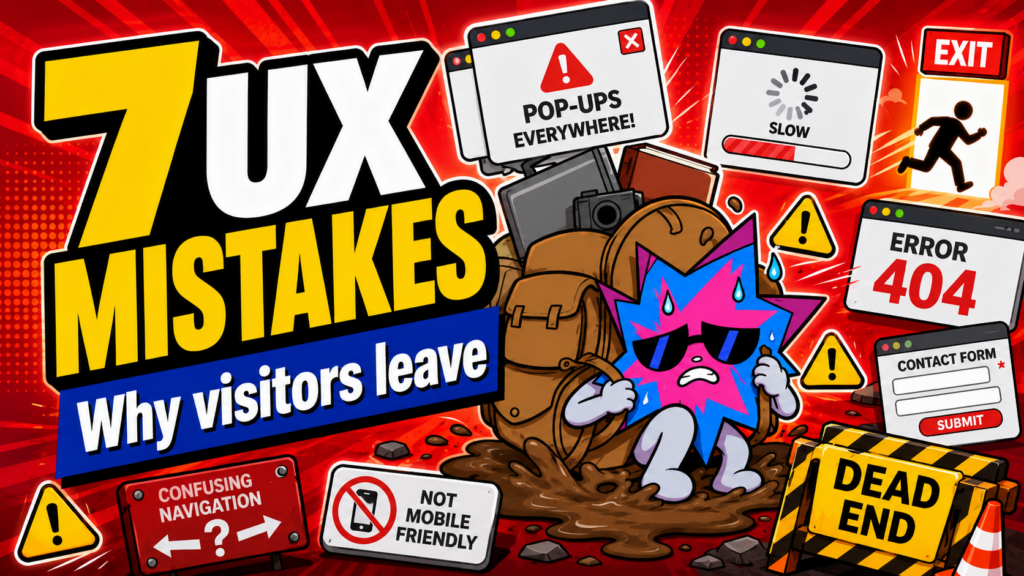
1. Making People Decode What You Do
The fastest way to lose a visitor is to make them work out what your business actually offers. Vague positioning, abstract slogans, and industry language may sound polished internally, but they can make a first-time visitor hesitate.
A strong opening should make three things obvious:
- What you offer
- Who it is for
- Why the visitor should care
For example, “We create transformative digital experiences” could describe almost anything. “We build fast, high-converting websites for Singapore businesses that want more enquiries” gives the visitor a clearer starting point.
How to fix it: rewrite the hero section in plain language, then support it with a short explanation, relevant proof, and a CTA that matches the offer.
Related reading: How to Tell Your Brand Story on Your Website So Customers Actually Care [add internal link before publishing]
2. Making the First Screen Slow or Unstable
A site can have excellent content and still lose visitors before that content becomes visible. Slow hero images, heavy videos, delayed interactions, and layout shifts make the business feel less reliable before the visitor has even read the message.
Google’s Core Web Vitals focus on loading performance, interaction responsiveness, and visual stability. They are useful because they measure whether users can see and use a page smoothly, not just whether a technical audit gives a nice score. [Source: web.dev]
How to fix it: start with the first visible content. Optimise the hero image or video, remove unnecessary scripts, avoid lazy loading the critical hero asset, and test buttons and menus on a real phone.
Related reading: How to Fix a Slow Website: 10 Fixes to Stop Losing Customers [add internal link before publishing]
3. Letting Visual Clutter Overpower the Message
When every element tries to be important, no element feels important. Too many colours, competing type styles, dense copy, animated decorations, and equally weighted buttons can turn a page into a room where everyone is speaking at once.
Visual hierarchy should create a sequence: headline first, supporting line second, proof next, then the CTA. Use contrast, size, spacing, position, detail, and negative space to make that sequence easy to follow.
How to fix it: remove or soften anything that competes with the page’s main message. Give the value proposition and primary action room to breathe.
Related reading: How to Structure Your Website So Visitors Know What to Do Next [add internal link before publishing]
4. Hiding Useful Information Behind Confusing Navigation
A navigation menu should help users reach the information they are actively looking for. It should not become a dumping ground for every page the business owns.
A large ecommerce store may need categories, filters, and multi-level menus because visitors are trying to narrow down many products. A service business usually benefits from fewer top-level choices, clearer labels, and strong contextual links inside the page.
How to fix it: list every page, then decide which few routes deserve a place in the main header. Move policies, low-priority pages, and supporting information to the footer or deeper routes. Use labels that explain themselves.
5. Giving Visitors Vague or Missing Next Steps
Visitors may understand the offer and still leave because they do not know what you want them to do next. A generic “Learn More” can work in some contexts, but a page often needs something more specific.
“Get a Project Estimate”, “See How the Process Works”, or “Book a Free Website Strategy Call” gives more direction than “Click Here”. The right CTA should match what the visitor has just learned and what they are ready to do.
How to fix it: decide the page’s main conversion action, place it after enough context and proof, explain what happens after the click, and make the button easy to use on mobile.
Related reading: How to Write Website Buttons and CTAs That Get More Enquiries [add internal link before publishing]
6. Treating Mobile as an Afterthought
A desktop page can look polished and still become a frustrating mobile experience. Text may be too small, buttons may be hard to tap, images may crop badly, menus may become crowded, and the opening message may get pushed so far down that the visitor loses the point of the page.
W3C’s reflow guidance explains that most content should remain usable at a width equivalent to 320 CSS pixels without loss of information or functionality or the need to scroll in two directions. The point is simple: people should not have to fight the page just to read it. [Source: W3C]
How to fix it: review the mobile layout as its own experience. Stack the content deliberately, keep key information visible, make buttons and forms easy to use, and test the page on real devices.
Related reading: The Comprehensive Guide on Responsive Websites [add internal link before publishing]
7. Asking for Trust Without Offering Proof
A business can claim that it is trusted, experienced, premium, or the best. But the visitor still needs a reason to believe it.
Proof can include relevant reviews, a clear process, specific examples, verified outcomes, real names, transparent policies, visible contact details, source-linked facts, and a site that feels well maintained. The key is that the evidence should be specific and real.
How to fix it: look at the point where visitors are most likely to hesitate, then place the right proof there. A testimonial beside a service claim, a clear process before a form, or a source below a statistic can reduce doubt more effectively than a random logo wall at the bottom of the page.
Related reading: 10 Tips That Will Make Your Website Look More Trustworthy Instantly [add internal link before publishing]
How to Diagnose the Right Problem First
Do not fix the most visible issue just because it is easy to notice. Find the point where users are actually getting stuck.
- Ask someone unfamiliar with the business what they think the page is offering after ten seconds.
- Review session recordings, heatmaps, form-drop-off data, and Search Console queries where available.
- Test the page on a slower connection and a real phone.
- Check whether the CTA works from the visitor’s perspective, including the confirmation and follow-up.
- Look for patterns: are visitors leaving before they reach proof, struggling to find a service page, or opening a form but not completing it?
Why it matters: a slow page and a confusing message can both produce low engagement, but they need different fixes. Diagnose before you redesign.
Quick Friction Checklist
| Area | Question to ask before publishing |
| Clarity | Can a new visitor tell what we do and who it is for in a few seconds? |
| Speed | Does the most important visible content appear and respond without obvious delay? |
| Hierarchy | Can a visitor scan the heading, proof, and CTA without competing distractions? |
| Navigation | Can they find the few pages they are most likely to need? |
| CTA | Does the next step match the page and explain what happens next? |
| Mobile | Can they read, tap, navigate, and complete a form on a smaller screen? |
| Trust | Do our claims have real proof, context, and accurate information behind them? |
Frequently Asked Questions
Do visitors always leave because of bad design?
No. Sometimes the offer is not relevant, the price is outside their budget, or they are simply researching. Good design cannot make every visitor convert, but it should remove avoidable friction for the people who are a good fit.
Should I redesign the whole website if people are leaving?
Not automatically. Start by finding the specific issue. A focused rewrite, speed improvement, navigation cleanup, or stronger proof section may solve the problem without a full rebuild.
What should I fix first?
Start with the first point of friction. Usually that means the opening message, performance of the first screen, or the main CTA. Then improve the rest of the journey in order.
Final Thoughts
Visitors leave when the website makes the next step harder than it needs to be. The solution is not to add more noise. It is to remove uncertainty, reduce friction, and make the page feel like it respects the visitor’s time.
Start with the message. Make the page fast. Guide attention. Keep the route clear. Offer proof. Then test whether a real person can use the site without you standing beside them to explain it.