Quick Answer
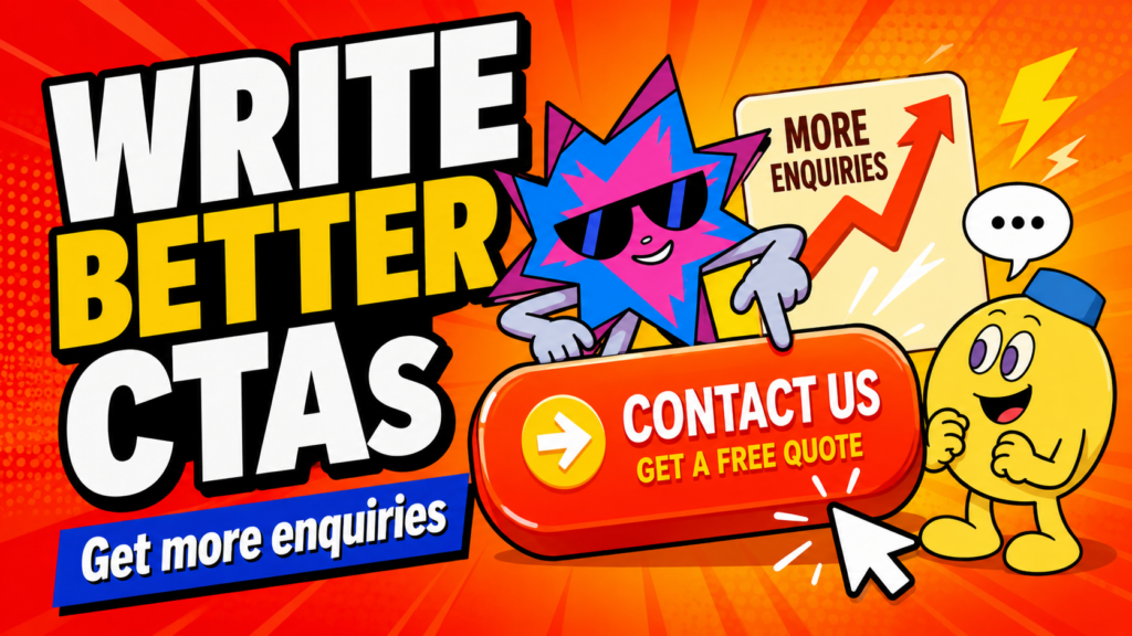
A strong website CTA tells visitors exactly what they can do next and why that next step is worth taking. Write the action in plain language, match it to the page they are on, make the button easy to spot, and remove uncertainty about what happens after the click. The best CTA is not the cleverest line. It is the one that makes the next decision feel obvious.
Key Takeaways
- Match your CTA to the visitor’s readiness. A person reading an introductory article may want a guide or example first, while someone comparing a service may be ready to book a call.
- Replace vague labels such as “Submit” or “Learn More” when a clearer next step is available, such as “Get a Project Estimate” or “See How the Process Works”.
- A button is only the visible part of the CTA. The surrounding proof, the form, the confirmation message, and the follow-up process all determine whether the click feels safe enough to make.
Why CTAs Matter
A website can explain the business beautifully and still lose the visitor at the final moment. The reason is often simple: the website never makes the next step clear enough.
A call-to-action, usually shortened to CTA, is the instruction that turns interest into movement. It can be a button, a text link, a form prompt, a click-to-call number, or a checkout step. Its job is not to pressure people. Its job is to stop them from having to guess what comes next.
The impact is easiest to see in ecommerce. Baymard Institute reports that 18% of US online shoppers have abandoned an order because the checkout process felt too long or complicated. That figure is ecommerce-specific, but the broader lesson applies to service websites too: when the route to action feels unclear or unnecessarily demanding, people often delay or leave. [Source: Baymard Institute]
| A CTA is a promise about the next step. “Book a Free Website Strategy Call” tells the reader more than “Contact Us”. It signals what they will get, what the conversation is to involve. |
Related reading: How to Build a High-Converting Website: 15 Proven Elements [add internal link before publishing]
What a Website CTA Actually Is
A CTA is not only a colourful button. It is any piece of copy that helps a visitor move from one useful stage to the next. That could mean:
- Reading a service overview and then viewing the process
- Comparing a package and then requesting an estimate
- Watching a product demonstration and then adding an item to cart
- Reading an article and then exploring a related guide
- Completing a short form and then receiving a clear confirmation
A CTA works best when it fits the moment. Asking for a sales call at the top of an educational guide can be too early. Offering a practical next resource or a short checklist may be more helpful. On the other hand, hiding your contact action after a visitor has read pricing, proof, and process can make the journey unnecessarily hard.
Start With the Visitor’s Next Decision
Before writing button copy, ask one question: what decision is this visitor ready to make right now? The answer should come from the page purpose, not from a vague desire to “get more leads”.
| Where the visitor is | CTA that usually fits better |
| First visit to the homepage | See Our Services, Explore Our Work, or Understand the Process |
| Reading a service page | Get a Project Estimate, Book a Discovery Call, or Ask About Your Requirements |
| Reading an educational article | Read the Related Guide, Use the Checklist, or See the Service Behind This |
| Comparing a product | View Product Details, Check Delivery Options, or Add to Cart |
| Near a long form | Start Your Enquiry, Get a Reply Within [timeframe], or Send Us Your Project Brief |
Why it matters: people are more likely to act when the CTA matches the question already in their head. A CTA should feel like the natural next line in a conversation, not a sudden sales interruption.
Write the Action and Outcome Clearly
A useful CTA often combines a clear action with a clear outcome. The formula is simple:
| CTA formula Action verb + specific next step or outcome. For example: “Get a Project Estimate”, “View Your Website Audit”, “Book a Free Website Strategy Call”, or “See the Full Process”. |
Compare these examples:
| Vague | Clearer and more useful |
| Submit | Send My Enquiry |
| Learn More | See How the Process Works |
| Click Here | View the Website Checklist |
| Contact Us | Book a Project Discussion |
| Get Started | Get a Project Estimate |
| Buy Now | Add to Cart and Check Delivery |
The goal is not to make every button longer. It is to remove unnecessary uncertainty. “Submit” tells the visitor what the website will do. “Send My Enquiry” tells them what they are doing and frames the action in their own language.
Match CTAs to the Visitor’s Readiness
Not every visitor is ready to enquire immediately. Some are still figuring out whether the business is relevant. Others are comparing options. Others have already decided and only need a low-friction way to begin.
You can support these stages without turning every page into a maze of buttons:
- Early stage: use a softer CTA, such as “See How It Works”, “Read the Guide”, or “Explore Our Services”.
- Consideration stage: offer proof and clarity, such as “See Our Process”, “Compare Your Options”, or “Read the Case Study”.
- Decision stage: make the conversion CTA direct, such as “Book a Strategy Call”, “Request a Quote”, or “Start Your Project”.
Why it matters: a site becomes more respectful and more persuasive when it lets people take the next step they are actually ready for.
Use Primary and Secondary CTAs Without Clutter
Most key pages need one primary CTA and, where useful, one quieter secondary CTA. The primary CTA supports the main business goal. The secondary CTA gives hesitant visitors a lower-commitment way to continue.
For example, a web design service page might use:
- Primary CTA: Book a Free Website Strategy Call
- Secondary CTA: See How Our Website Process Works
The primary action should be visually stronger. The secondary action can be a text link, an outlined button, or a less prominent style. Do not give three different buttons equal visual weight, or visitors may have to spend energy choosing between actions before they have understood the offer.
Place CTAs at Natural Decision Points
A CTA should appear where a reader has enough context to use it. That is why repeating the same CTA thoughtfully can be useful. It gives people a chance to act when their confidence reaches the right point.
Useful CTA locations include:
- Near the hero section, after the main offer is clear
- After a section that explains the user’s problem or desired outcome
- After proof, testimonials, pricing context, or a clear process
- At the end of a long page or article
- In a sticky header or chat option, when it does not obscure content
- Beside a form, together with a sentence that explains what happens after submission
Why it matters: the right CTA in the wrong place is still easy to ignore. Put it after the point where the page has earned enough trust for that action to make sense.
Reduce the Friction Around the Click
A button can be perfectly written and still fail because the next page feels risky, complicated, or unclear. The CTA itself needs supporting context.
- Tell people what happens after they click. For example: “We will reply within two working days.”
- Keep enquiry forms focused on the information you genuinely need first.
- Explain whether a consultation is free, paid, online, or in person.
- Avoid promising “no obligation” if the sales process does not actually feel low pressure.
- Make privacy and data-handling information easy to find when asking for personal details.
- Do not use surprise account creation, hidden charges, or misleading urgency.
Why it matters: conversion friction is often the uncertainty around the action, not the number of words on the button. A visitor should not have to wonder whether clicking “Get Started” will open a pricing page, force a booking, or send them into a form with fifteen fields.
Make Buttons Visible, Accessible, and Tappable
A CTA has to be noticed and used before its wording can do any work. Make the button clearly distinct from surrounding content, give it enough contrast, and leave enough breathing room around it so people can see that it is an action.
On touch screens, button size also matters. W3C’s WCAG 2.2 guidance sets a minimum target size of 24 by 24 CSS pixels for pointer inputs, with defined exceptions. That is a minimum accessibility requirement, not a reason to make every mobile button tiny. In practice, important actions should feel comfortably tappable and should not sit too close to other actions. [Source: W3C]
Why it matters: the visitor may be ready to take action while using one thumb on a crowded mobile screen. Do not make the final step harder than it needs to be.
Test the Full Path, Not Just the Button
A CTA is part of a path. Test the entire route from the moment a visitor sees the button to the moment they receive confirmation.
- Does the button lead to the page, form, calendar, checkout, or phone action it promises?
- Does the page load quickly on mobile?
- Can a user complete the form without being asked for unnecessary information?
- Does the confirmation message explain what happens next?
- Do you receive the enquiry, and does your team reply within the timeframe you imply?
- Is conversion tracking set up so you can see which CTAs actually lead to meaningful actions?
Why it matters: a strong CTA that leads to a broken form is worse than a weaker CTA because it creates a clear expectation and then breaks it.
CTA Examples for Service Businesses and Ecommerce
| Situation | Examples |
| Service homepage | Book a Free Website Strategy Call; See Our Services; Tell Us About Your Project |
| Service page | Get a Project Estimate; See the Process; Ask a Question About Your Requirements |
| Portfolio or proof page | See How We Solved This; View the Full Project Breakdown; Start a Similar Project |
| Educational article | Read the Related Guide; Use the Checklist; See the Service Behind This |
| Product page | Choose Your Size; Check Delivery Options; Add to Cart |
| Checkout | Continue to Delivery; Review Your Order; Complete Secure Checkout |
Use examples as starting points, not templates to copy blindly. The best wording depends on the offer, the visitor’s readiness, and what the next step really involves.
Common CTA Mistakes
- Using vague labels when a clear next step is available.
- Asking for a large commitment before the page has built enough trust.
- Giving every CTA the same visual weight.
- Hiding the primary action after a long page.
- Making the button look like ordinary text or placing it too close to other actions.
- Using a CTA that promises one thing and leads to another.
- Forgetting the confirmation message and follow-up experience after the click.
The pattern behind all of these mistakes is the same: they make the visitor do more thinking than necessary.
How Nebulon Approaches CTAs
At Nebulon, we treat CTAs as part of the page story, not something pasted in once the design is complete. The action needs to follow the moment where the visitor has enough clarity and proof to take it.
A personal tip from our builds: make important actions easy to reach without making the site feel desperate. We often use a clear CTA in the hero, repeat it after key proof or service sections, and keep an accessible option in the sticky header or chat area. The wording stays direct. “Book a Free Website Strategy Call” tells people more than a vague “Let’s Talk”, and it makes the value of the next step easier to understand.
Related reading: How to Structure Your Website So Visitors Know What to Do Next [add internal link before publishing]
Quick CTA Checklist
| Check | Question to ask before publishing |
| Purpose | Does this CTA match the decision the visitor is ready to make? |
| Copy | Does the wording explain the action and likely outcome? |
| Placement | Does it appear after enough context, proof, or explanation? |
| Hierarchy | Is there one clear primary action and, where needed, a quieter secondary action? |
| Friction | Do visitors know what happens after they click? |
| Mobile | Is the CTA visible, tappable, and not crowded by other actions? |
| Follow-up | Does the form, confirmation, tracking, and response process work as promised? |
Frequently Asked Questions
Should every button be a CTA?
No. Some buttons are functional controls, such as opening a menu or changing a product image. A CTA is specifically designed to move the visitor toward a meaningful next step, such as an enquiry, purchase, booking, or deeper piece of content.
Is “Learn More” always a bad CTA?
Not always. It can work when the destination is obvious from the surrounding context. But when you can name the next step more clearly, such as “See the Process” or “View Pricing Options”, the visitor usually has less to guess.
How many CTAs should a homepage have?
A homepage can include several CTA placements, but they should support one main action and a small number of relevant secondary routes. The exact number matters less than whether visitors can quickly understand which action is most important.
Should CTAs use urgency?
Use urgency only when it is real and relevant, such as a genuine deadline, booking availability, or limited event capacity. Fake urgency can damage trust quickly.
Final Thoughts
A good CTA does not drag people forward. It makes the next step feel clear enough to choose.
Write the action in the visitor’s language. Put it at the right moment. Explain what comes after the click. Then test the full path to make sure your website keeps the promise the button makes.