Unmute Creatives

I am a button

Share

Team

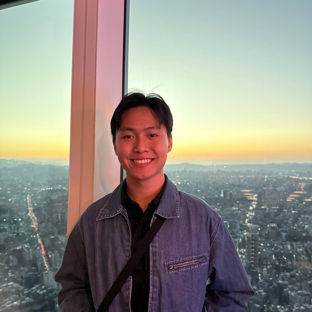
Lenny
Team Lead
Shirou
Web Designer
Clint
Project Guide
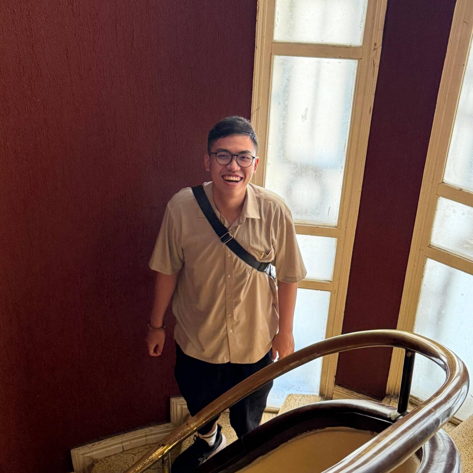
Junxiang
Trainee

Deliverables

I am a button

Share

Building a Website That Feels as Engaging as the Content It Sells: Our Case Study for Unmute Creative

Social media agency cannot afford to have a quiet website. It needs movement, personality and proof that the team behind it understands attention. For Unmute Creative, our goal was to create a website that reflected what they do best: turning content, strategy and video into attention that matters.
Ian Ng
Overall, from the moment we met the team at Nebulon Design until the moment we launched and beyond, we can describe our time with this dedicated team as effortless and motivating.
click  •  to  •  read  •  full  •  review

Understanding The Brief

The brief was clear. We had to create a website for a social media company that helps brands drive attention through content, video and digital strategy. At the same time, the website had to stay true to Unmute Creative’s brand. It could not feel overly corporate, flat or templated. Social media is expressive by nature, and the website needed to reflect that sense of movement, creativity and personality. The challenge was to balance playfulness with professionalism. We wanted visitors to immediately understand what Unmute Creative does, feel the energy of the company, and see proof of the results they can create.

Creating the Visual Direction

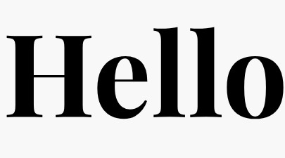
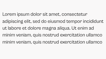
Typography played a key role in shaping the website’s personality. To sharpen the visual identity, we proposed a font pairing of Cabinet Grotesque for body text and Playfair Display for display moments.

Cabinet Grotesque

was chosen for its clean, modern and refined feel. Its contemporary structure suits a social media and marketing agency, giving the website a polished look without making it feel cold.

Playfair Display

was selected to create contrast. As an expressive serif font, it added character and a touch of elegance to key sections. Paired together, the two fonts created a balance between modern professionalism and creative flair.

Colours

#D78328
#EEEBE2
#000000
#FFFFFF

Building a Hero Section That Says It Clearly

For the hero section, we worked with Unmute Creative to create a clear and compelling opening statement:

“We transform digital noise into clear, compelling brand voice where strategy meets high-impact video to drive engagement.”

This line immediately communicates what Unmute Creative does and speaks directly to a problem many brands face today: too much digital noise and too little meaningful attention

To make the hero feel more alive

We added interaction to the phrase “drive engagement.” When users enter the website, the words expand and shake slightly, almost like a ticket or stamp reacting to attention.

This small movement sets the tone right away.

It tells the visitor that this brand understands interaction.

We also used images of smiling people in the background to create warmth and approachability, helping the website feel less like a cold agency portfolio and more like a lively creative partner.

Designing for Social Proof

For a social media agency, proof matters.Anyone can say they create good content. The website needed to show it.

Statistics

Throughout the site, we made social proof a key part of the experience. We included performance-based statistics, including a 1,200% increase in shares through video content, to communicate impact quickly and give visitors a reason to believe in the agency’s capabilities.

Logos

We also showcased logos of Unmute Creative’s past clients, including well-known brands, to build credibility and show the trust they had already earned.

Interactive videos

Beyond static proof, we added playable video sections where visitors can watch the content Unmute Creative has produced. Instead of simply saying, “We make videos,” the website lets the work speak for itself.

Live Social Content

Because Unmute Creative operates heavily in social media, we wanted the website to stay connected to their active platforms. We integrated their Instagram feed into the About section, allowing the website to reflect their latest posts without requiring constant manual updates. For a social media agency, this was important. Their website should not feel disconnected from their platforms. It should feel like an extension of their content ecosystem.

Making Their Work Interactive

Here goes your text ... Select any part of your text to access the formatting toolbar.

Making Their Work Interactive

Another major feature was the integration of TikTok and Instagram content into a filterable showcase. Inspired by Make Dream Website’s video on “Portfolio Gallery with Live Preview Box”, we adapted the concept into a custom showcase for Unmute Creative’s social media work. Using API-based integration, we displayed selected TikTok and Instagram posts directly on the website, allowing visitors to explore real content the team had produced. Users can filter the showcase by brands such as FairPrice, Unity and Lotte Mart, making it easier to browse relevant work. When they hover over a post, they can see the number of views the video achieved, alongside a “Watch Now” button that lets them view the content directly. This turned the portfolio from a passive gallery into an interactive proof point. Instead of simply telling visitors that Unmute Creative can generate attention, the website lets them filter, preview and watch the results for themselves.

Refining the Website Experience

After the main website was completed, we continued refining the experience with additional interactions and animations. The goal was not to animate for the sake of animation. Every movement had to support the brand and make the website feel more engaging.
On the service page, we also wanted to communicate Unmute Creative’s content production process in a more visual and memorable way. Inspired by Make Dream Website’s “Make this Stacked Card Scrolling Effect/Animation”, we adapted a stacked card scrolling interaction to present the process with more rhythm, depth and movement. This helped turn a standard process section into an interactive storytelling moment, making the service flow easier to follow while keeping the website aligned with Unmute Creative’s energetic and creative personality. We also selected images intentionally, making sure each visual supported the section it appeared in, whether it was about their work, team, process or results.

Responsiveness Across Devices

1920 px
1280px - 1440px
1280px - 1440px
1280px - 1440px

SEO and Technical Foundations

Beyond design and interaction, we implemented basic SEO foundations to help the website start strong. This included sitemap setup, robots.txt configuration, meta titles, meta descriptions and keyword-focused image naming. We also improved accessibility by making image details more functional for users who rely on assistive tools. On the performance side, we optimised loading speed and worked on key experience metrics such as LCP, INP and general page performance. We also added smooth scrolling to make the browsing experience feel more refined and less jittery.

The Result

The final website is a vibrant, interactive and personality-filled digital home for Unmute Creative. It communicates what they do clearly, showcases their work confidently and gives users proof through client logos, performance highlights and playable content. Most importantly, it reflects the energy of a social media agency that knows how to turn attention into engagement. This was not just a website about social media services. It became a website that behaves like the work Unmute Creative creates: dynamic, visual, engaging and built to hold attention.

Credits and Acknowledgements

Lenny

organised, designed, planned and oversaw the full website process.

Shirou

Designed & Developed the website.

Clint

Guided Shirou through the developement and design process.

Junxiang

supported the project through SEO-related improvements, including keyword-focused image naming and accessibility considerations.

Make Dream Website

Special credit also goes to Make Dream Website’s “Portfolio Gallery with Live Preview Box” video, which served as a technical and interaction reference for the filterable social media showcase implemented on the website. Special credit also goes to Make Dream Website’s “Make this Stacked Card Scrolling Effect/Animation” video, which served as an interaction reference for the stacked card scrolling section used to communicate Unmute Creative’s content production process on the service page.

Audrey

We would also like to thank Audrey for contributing greatly to the design of the website and the Unmute Creative team for trusting us with the creation of their website, allowing us to bring their brand personality into a digital experience.

Final Thoughts

A strong website for a social media agency should not feel static. It should have rhythm, movement and a reason for people to keep exploring. For Unmute Creative, we wanted the website to reflect the same thing they help their clients achieve every day: attention that feels intentional, content that feels alive and a brand voice that cuts through the noise. Because in a world full of content, the brands that win are not always the loudest. They are the clearest, the most engaging and the most memorable.

Awards

I am a slide

Content goes here ..

Click me

Just another slide

More content to come ..

Learn more

Ready to build a website that performs? Get in touch with us